Software DevelopmentSoftware Development MethodologiesPlanning web applicationsIT strategyUX/UI designWebsites14 min czas czytania19 182 znaki2616 słów
The process of creating a website - A complete overview of the steps for entrepreneurs
Learn more about Process. A practical guide with concrete tips and examples. Learn best practices and avoid common mistakes.
What do you find in the article?
- Effectiveness of the methodical approach - Adopting a structured process can reducecosts by 30-40%. Projects without such an approach often go 67% over budget and can be delayed by several months.
- The importance of a well-prepared brief - A carefully drafted specification helps avoid as much as 80% of later changes and ambiguities that may arise in cooperation with the contractor.
- Wireframing before coding begins - Testing a concept on paper is about 50 times cheaper than later modifications to an already working website.
- The full process: from strategy to publication - We outline seven key steps that lead from needs analysis to implementation, along with a set of tools and checklists at each step.
Introduction - Why process matters
Do you realize that most website projects tend to go over budget, and many are never completed? The difference between success and failure often lies in one key element: a well-organized development process.
Imagine building a house without any plan. First the foundations, then the walls, and at the end you realize you forgot the installations. The same is true of creating a website without a thoughtful process.
Chaos in project management is one of the most common causes of project failure. Standish Group research shows that projects without a defined workflow can have up to a 150% higher risk of going over budget and a 200% higher chance of delays. In practice, this means that a planned 10,000 zlotys can quickly turn into 25,000 zlotys, and the implementation time can extend from three to eight months.
The methodical approach works like a GPS in navigation - it shows exactly where you are and how to get to your destination. With a structured workflow, the entrepreneur has a full view of what stage the project is at, what the next steps are and how much time is left for completion. The transparency of the process eliminates unpleasant surprises and allows you to control costs.
A well-planned process brings tangible benefits: it reduces lead time by up to 30%, reduces the number of changes and revisions, and improves communication between teams. Most important, however, is that the final product actually meets business objectives.
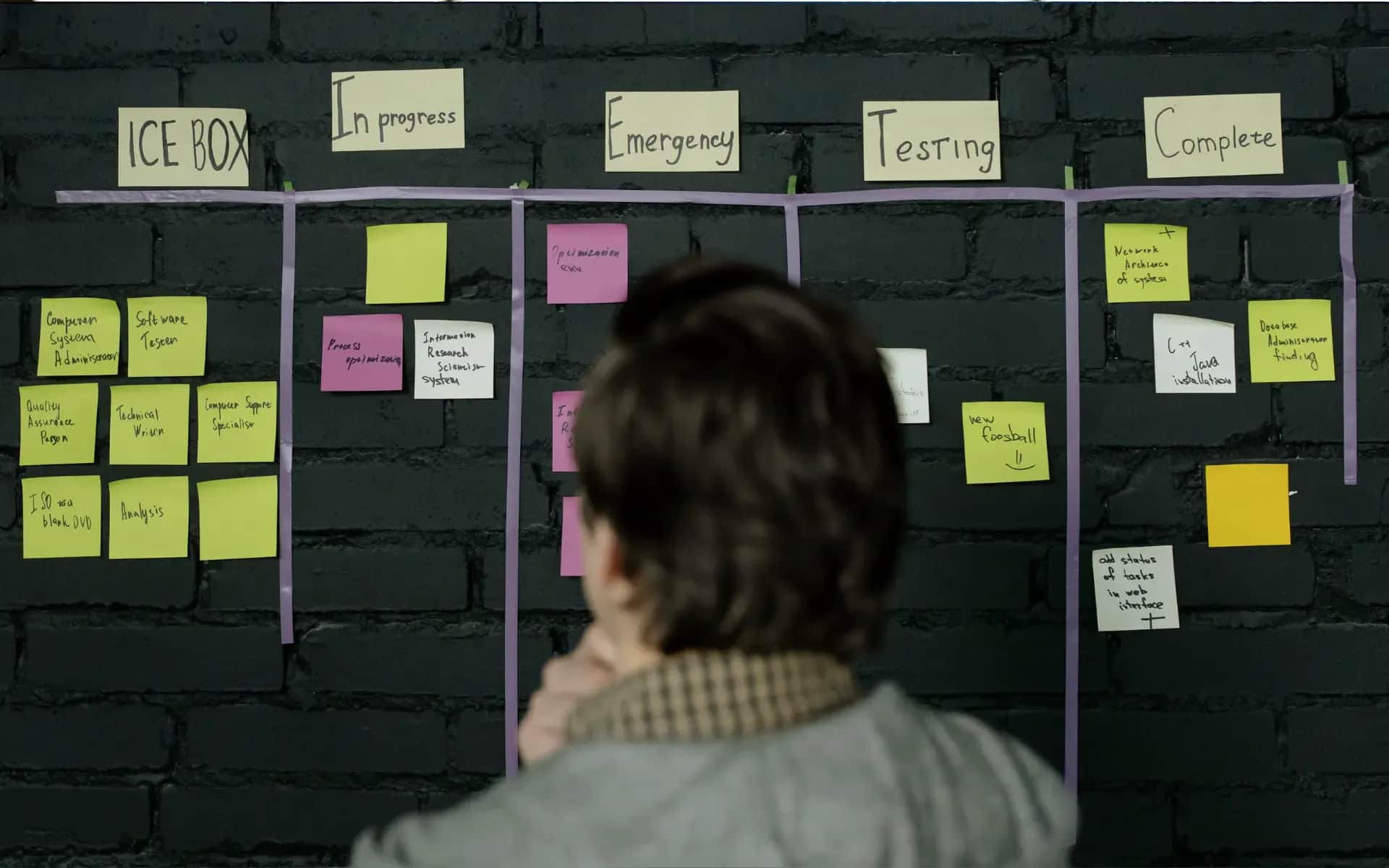
The complex process of developing a website consists of seven key stages: strategy and planning, UX/UI design, content preparation, technical implementation, testing, publication and post-implementation optimization. Each of these stages requires the right expertise, tools and time. In the following sections, we will go through each stage, showing the practical aspects of implementation and the most common pitfalls to avoid.

Project strategy and planning
Every success story begins with a key question: why do you even want to create this website? While this may seem obvious, many entrepreneurs answer: "because the competition has a site." However, this is not a strategy, but rather a path to problems.
Truly understanding your needs begins with an awareness of your business goals. Is it to increase online sales, build brand recognition or perhaps improve customer service? Each goal requires a different approach to site functionality and structure.
Equally important is the analysis of your target audience. Who are your customers? How do they use the Internet? What challenges and needs do they have? This information affects everything from the color scheme to the way you navigate. Young entrepreneurs may prefer minimalism and speed, while older people need clearer menus and larger buttons.
Determination of budget and schedule
Realistic financial planning is the basis of any project. A budget of 5K gives different possibilities than 50K. Dreaming of advanced CRM integrations with limited funds is not a good idea. It is better to implement a simpler project decently than a complex one poorly.
The schedule must also be realistic. A simple business card website is a matter of 2-4 weeks, while e-commerce with integrations may require 3-6 months. Remember that you are also involved in the process - content preparation, design approvals, testing. Your availability affects the speed of implementation.
Selection of an implementation partner
The most expensive agency does not always guarantee the highest quality, and the cheapest often ends up with complications. Check the portfolio, references, but pay attention first of all to the way of communication. Can they explain complex issues in simple terms? Do they ask about key aspects of your business?
A good contractor starts with a detailed brief. This is a document that specifies expectations, scope of work and success criteria. Learn how to prepare an effective brief in the article:Site Design Brief.
The planning phase usually takes about 10-15% of the time of the entire project, but its quality often determines the success of the other 85%.
User experience design
You already have a strategy and a goal on the horizon. Now it's time to get a handle on what users will actually see. But don't be fooled - starting with colors and fonts is a trap that many projects fall into.
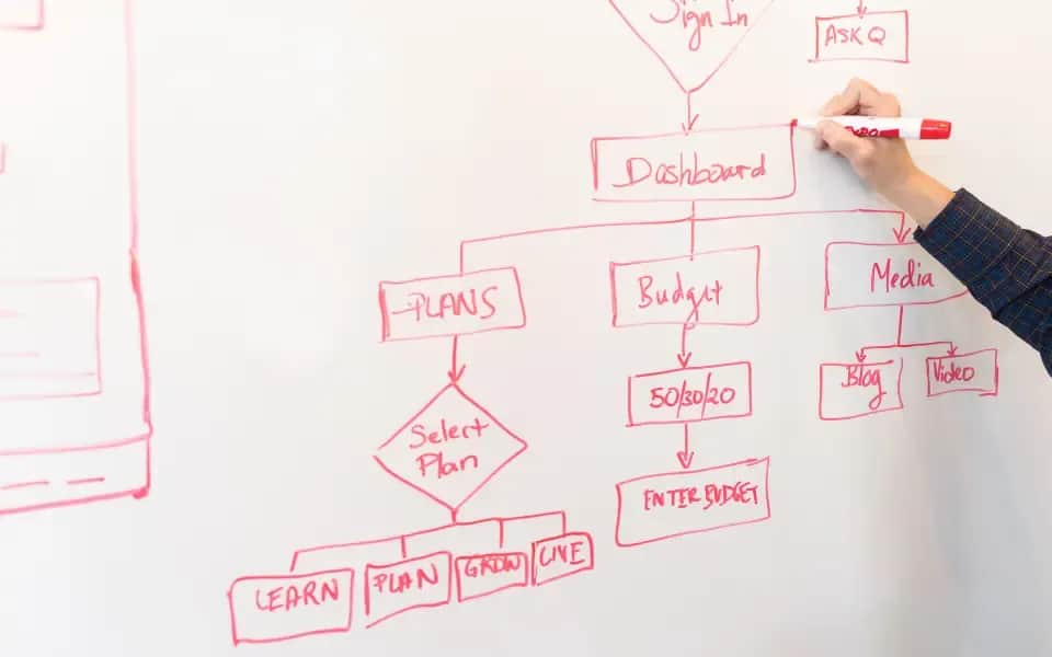
The role of wireframes in structure planning
Wireframe is kind of like a skeleton of the page. Black rectangles on a white background. It may sound a bit boring, but it's a key stage of any project.
Think of a wireframe as an apartment plan. It indicates where the kitchen will be and where the living room will be, but it doesn't deal with the color of the walls or the choice of furniture. It focuses on functionality.
Good wireframes help solve basic problems. Where to put the contact form? How to guide the user to the shopping cart? Where to hide additional menus?
At this stage you test the navigation logic. And that's a good thing, because it takes five minutes to change the order of sections in a wireframe, while the same change on a finished site is a week's work.
For details on creating skeletons, see:Wireframe.
An iterative approach to UX/UI design
Design is a process, not something you do once. The first version always needs tweaking. So does the second. Only the third begins to be useful.
That's why we work iteratively. We create a wireframe, test, tweak. We add colors, test again, change. We implement animations and test again.
Each iteration is better than the previous one. But it takes time and patience to do so. Customers often want to see something concrete after just one week. That's a recipe for failure.
A good UX designer asks questions that may seem strange. "Why would a user click this button?" "What happens if they make a mistake?" "Does the color really matter?"
The wireframing process is described in:Wireframing.
Testing concepts before implementation
Testing on real users is a real eye-opener. What seems obvious to the designer may be quite incomprehensible to the customer.
The simplest test? Show the wireframe to a friend. Let him try to "buy" a product or find information. See where he stops, where he clicks, where he gets confused.
Professional UX testing is a separate topic, but even a basic check will help detect major problems. It is better to correct errors now than after the site is published.
Complex design is discussed in:UX/UI design.
This stage takes about 20-30% of the project time. It may seem long, but it saves months of revisions later.
Content creation and preparation
Even the most beautiful graphic design is only the setting. It's the content that determines whether a user stays on the site or flees after a few seconds.
Information architecture planning
Information architecture is the art of arranging content in an understandable and intuitive way. It's not about flashy headlines, but a logical structure that the recipient will understand without instruction.
Start with an inventory: what information is necessary on the site? About the company, products, contact - this is standard. But does each service need a separate page, or is it better to create one collective one? Does having a blog make sense in your case?
Then build a site map, a hierarchical tree of all pages and subpages. Make sure the user gets to each piece of information in no more than three clicks. If more is needed, the structure is too complicated.
SEO-friendly content creation
Writing for a website is not the same as writing a book. Users scan with their eyes, look for specifics, and have short attention spans.
Start with keywords. It's all about naturally weaving in phrases that customers are looking for. If you run a hair salon in Krakow, instead of writing "we offer professional beauty services," write "hairdresser Krakow - cutting, coloring, styling."
Text structure matters. Use H2 and H3 headings to divide content into readable sections. Bulleted lists make information easier to digest. Bolding makes key content stand out. Don't overdo it - if everything is highlighted, nothing stands out.
Preparation of graphic and multimedia materials
Photos often speak more than text, but not every photo works. Stock smiles of models may not fit the construction industry.
Invest in professional photos of your products, team, implementations. Show a real company with real people. Customers prefer to buy from people, not from impersonal corporations.
Remember to optimize your files. Large size images can take a long time to load. Compress images, use appropriate formats and add ALT descriptions for ease of access.
Optimize content for conversions
Each page should have a specific purpose. A home page can encourage contact. A product page should lead to a purchase. A blog can build trust and drive to an offer.
Call-to-action must be clear. Instead of "check out our offer," it's better to write "request a free quote." Specific calls work better than generalities.
For more on content strategy, see:Content and Media.
This stage often takes the longest because it depends on the client. An agency can prepare a design in a week, but can wait up to three months for content.
Technical implementation
You already have a design, developed content, everything carefully planned. Now comes the crucial moment - turning the idea into a working website. This is the time when design visions become code reality.
Selection of technology and development tools
WordPress, custom code, or maybe a ready-made page builder? It's not a matter of a fad, but of matching the tool to a specific project.
WordPress often proves to be an excellent choice for most business projects. It's easy to use, offers plenty of plugins and allows for quick content updates. However, it can have its limitations - if not properly configured, it can sometimes be slow and vulnerable to attacks if proper security is not taken care of.
Custom code gives you full control over your design. Pages load faster, and every functionality is exactly what you need, without unnecessary additions. The downside is a higher development cost and greater difficulty in later management. Every change requires the support of a programmer.
Off-the-shelf wizards, such as Webflow or Squarespace, are a compromise of sorts. They work quickly and are relatively cheap, but offer limited customization options. They work well for simple business card sites, but may not meet the challenges of e-commerce or advanced integrations.
You can find the basics of HTML in:HTML Guide.
Responsive design and performance optimization
More than 60% of web traffic comes from mobile devices. A site that doesn't look good on a phone is potentially losing half of your customers.
Responsive design is not a luxury - it's a standard you must maintain. It's worth paying attention to the details. Menus that work on a computer may not be practical on a phone. Forms should be easy to fill out with a finger, not a mouse.
Loading speed is key. Every extra second of latency can mean 7% fewer conversions. That's why it makes sense to optimize images, minimize code and use caching. Google PageSpeed Insights is a helpful tool.
You can find ready-made solutions in:HTML Templates.
Integrations with external systems
A website rarely works in isolation. The CRM, the payment system, the newsletter, the chat - everything must work together.
APIs are kind of bridges between systems. But any integration can be a potential point of failure. The more connections, the greater the risk of problems. Plan integrations prudently - only those that are really needed.
Test all calls before publishing. A form that doesn't send leads to the CRM is a real loss.
You can find a practical guide in:How to make a website.
Implementation usually consumes 40-50% of the time of the entire project. This is the longest phase, but this is where the idea becomes a reality.
Testing and optimization
Is the website ready yet? It's not yet time to celebrate. What works flawlessly on the programmer's computer may prove problematic for the first-time user. Testing is not a formality - it's the last opportunity to fix bugs before the official launch.

Functionality and compatibility tests
Every element must work flawlessly. Does the contact form send emails correctly? Does the shopping cart add products correctly? Do menus expand on mobile devices? These are the basics, but it's the details that can cause trouble.
Test in different browsers. Chrome, Safari, Firefox - each has its own specifications. Users don't customize the browser for your site - it's up to you to make sure your site is customized for them.
Don't forget the different devices. The iPhone 13 is quite different from the old Samsung. The tablet in landscape mode shows a different view than in portrait mode. Any combination can reveal a new problem.
SEO and performance audit
Google is not forgiving of slow-loading pages. PageSpeed Insights can tell you what's slowing loading. Often it's oversized images or a heavy CSS file.
Pay attention to the basics of SEO. Are meta descriptions, H1 headers, internal links properly configured? Google Search Console will help detect most technical issues.
Checking responsiveness and UX
Responsiveness is not just a matter of fitting on a phone. It's also about user comfort on any screen. Are the buttons big enough, the text not too small, and the menus not too complicated?
Test on real devices, not just a browser simulator. Real devices can reveal real problems.
Preparation for implementation
The last step before publishing is to prepare a checklist. Database backup, SSL configuration, redirects from the old site, analytics settings - every detail matters.
Also have a contingency plan. What can you do if something goes wrong? How quickly can you get back to a previous version? Publishing on Friday night could end up with problems.
Good testing may take a week, but it will save months of post-implementation fixes.

Publication and implementation
All the tests are behind you, and the site works as expected in the test environment. Now comes that crucial moment - the live publication. It's a bit like the first flight of an airplane. You can prepare perfectly, but reality will verify everything only in practice.
Hosting and domain configuration
Choosing hosting is about more than just price per year. Sometimes what's cheap can turn out to be expensive, especially if your site stops working during a key marketing campaign.
Pay attention to the server parameters. The latest version of PHP, enough space, automatic backups, SSL included in the price - these all matter. Technical support in Polish can prove invaluable, especially at three in the morning.
It is a good idea to have the domain ready beforehand. DNS propagation can take up to 48 hours. If you plan to launch on Monday, take care of it as early as Wednesday. The last minute is not the best time for such activities.
Content migration and DNS settings
Moving a site from a test server to a production server is a subtle operation. One mistake in the database configuration and you will see only errors instead of content.
Start by backing up everything. Files, database, server configurations - everything is your insurance for the life of the project.
First, set a minimum TTL (Time To Live) for DNS. If something goes wrong, you will see the changes faster. After a successful migration, you can extend the TTL for better performance.
For publication details, see:Publish.
Monitoring the first days after the launch
The first 72 hours are crucial time. Users are relentlessly testing the site, Google is indexing the content, and all systems are running under full load.
Regularly check the server logs. 404 errors, slow queries, payment problems - all need monitoring. Google Analytics and Search Console will show how the site is doing with actual traffic.
Be prepared for user feedback. They will find bugs that the tests didn't catch. This is normal. The important thing is to react quickly and openly communicate any problems.
We describe the implementation process in:Publication.
Publication is not the end of the project, but the real beginning. Now the website starts working for your business.
Summary - Key to the success of the project
Through seven steps, hundreds of decisions and dozens of hours of work, one may wonder if there is a recipe for creating a successful website. While there is no one way, there are a few simple but key elements that can easily escape our attention.
Key success factors
First, well-defined goals are indispensable right from the start. A website created "because it's the right thing to do" is a dead end. In contrast, a site that is expected to increase the number of requests for quotes by 30% over the next quarter is a concrete goal that gives direction to any design decision.
Another important element is realistic time planning. Adding a 30% provision to each stage can be a lifesaver. Something unexpected can always happen - a graphic designer's illness, a delayed content delivery, or additional functionality on the last straight.
The third pillar is the quality of communication. Regular weekly progress reports, clear and precise feedback, and documentation of changes. If everyone knows what is going on, the project will not be derailed by misunderstandings.
Typical pitfalls of the project
One of the biggest risks is "scope expansion syndrome." You may start with a simple business card site and end up with an elaborate online store with a blog and reservation system. Every change is time and money. Determine the scope of the project and stick to it.
The second pitfall is perfectionism. A project that is 90% finished but waiting for two months for the "final touches" is a common sight. Better to publish a good site today than a perfect one in six months.
The importance of cooperation
Even the best agency won't create an effective site without client involvement. You are the one who knows your business, your customers and the specifics of your industry best. The contractor brings the technical skills, but the business content must be provided by you.
Shared responsibility for success is the key. It's not "they do, I judge," but "we create together." This difference can determine whether a project will end in success or mutual resentment.
Each stage of the process deserves a deeper analysis. It is worth delving into the details of each phase - from the brief to publication. The devil is in the details, but they are what distinguish average projects from exceptional ones.
💡Tip
Successful implementation is not only about technology, but also about effective communication and cooperation with the team and contractors.
What's next?
If you plan to implement in the next 2-3 months:
First steps:
- Define your business goals and needs - Understand why you want to create the site and what goals it should serve. Is it to increase sales, build your brand or improve customer service?
- Prepare a project brief - A carefully drafted brief will help avoid later changes and ambiguities in cooperation with the contractor.
- Set a budget and schedule - A realistic budget and timeline are critical to the success of the project. Include a buffer for unforeseen expenses and delays.
Do you need help?
- Make an appointment for a free consultation - We will discuss your case and help you plan the implementation.
If you are still gathering knowledge:
Recommended articles:
- Web site guides for businesses - Practical tips on various aspects of website development.
- Design - Learn more about the UX/UI design process and wireframing.